
The Persistence of Memory, painted by Salvador Dalí in 1931, is famous for its melting clocks. Look past them and it has one of the most usable colour palettes in modern art.
What colours are in The Persistence of Memory?
Deep sea blue fading to a pale, chalky turquoise in the sky
Ochre and gold in the sunlit cliffs
Olive and dark brown across the foreground
Silver blue and orange in the soft clocks and the pocket watch
Those colours work in a room because they are balanced: warm earth tones against cool blues, with plenty of muted ground in between. Schemes taken from a painting often hold together better than ones built from a paint chart, because the artist has already done the balancing.
Here I take the painting's main elements one at a time and show how to use their colours with cushions, from ochre and gold velvets to deep blue linen, with combinations you can recreate on your own sofa.
The melting clocks
The clocks are all soft curves, with silver blue faces and gold rims. In a room, that translates into flowing lines and colour that changes as the light moves. Strates in Bronze Olive has wavy embroidered layers, like rock strata, in bronze, olive, soft blue grey and cream, and Strates in Ambre Rose Poudre does the same in amber and dusty pink. For the gold, use a velvet such as Dolce Vita in Mordore, an old gold that glows rather than shines.


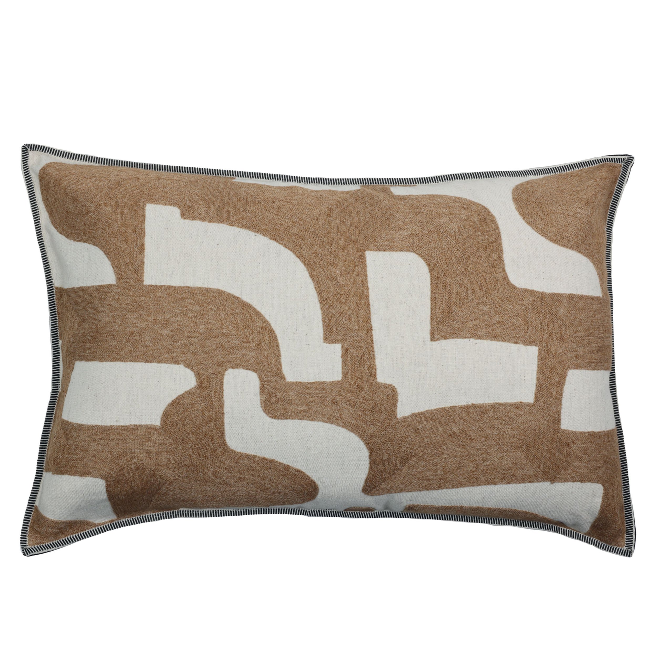

The sleeping figure
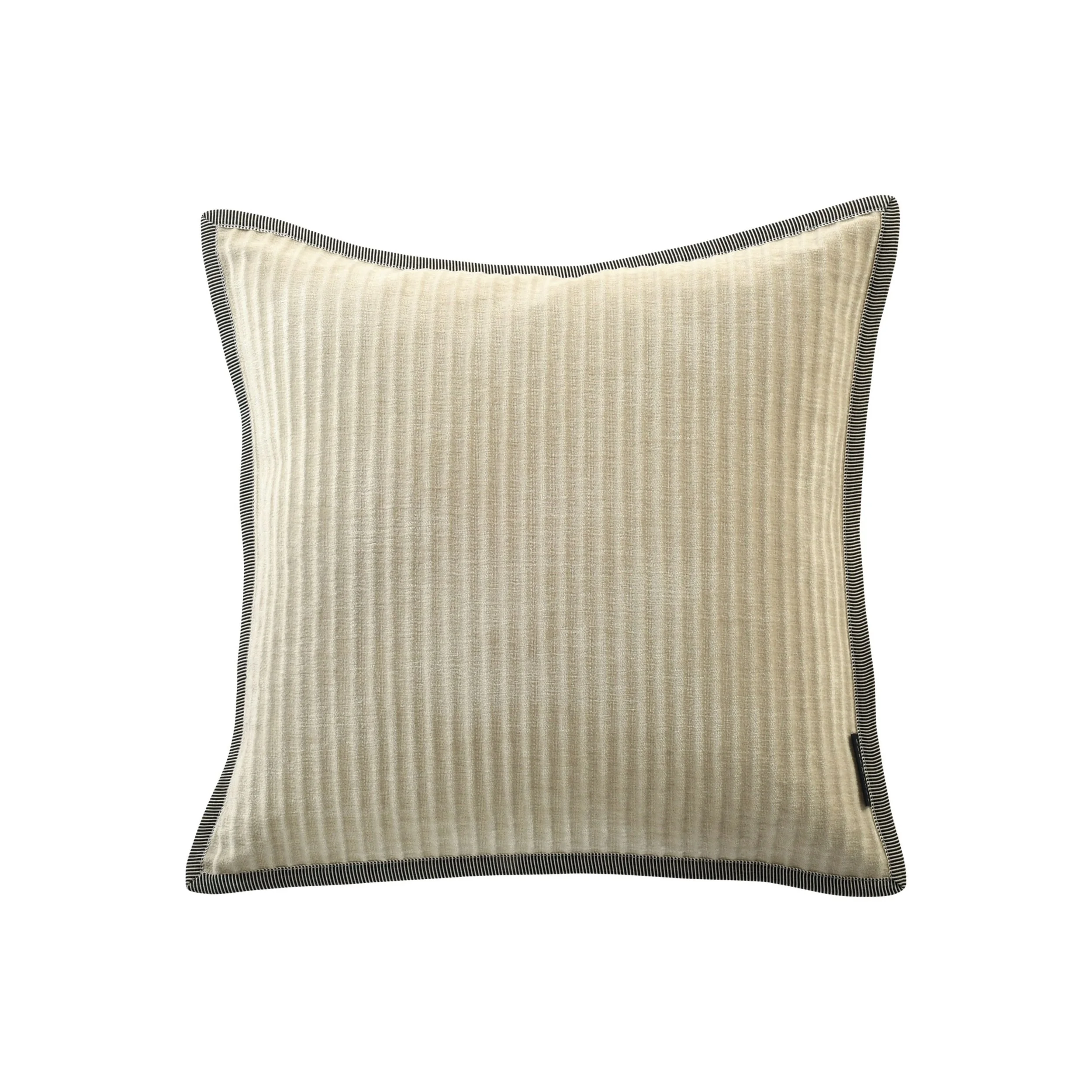
At the centre of the painting is a strange, pale figure draped across the ground, often read as Dalí himself. Its colours are soft and fleshy: beige, cream and muted grey. These are the quiet base of the scheme. Try Opulence in Lin, a ribbed oatmeal cream, the off white Solo in Ivoire, and Brooks in Kaki, a dark olive sateen, to bring in the colour of the foreground.






The orange pocket watch
The one closed watch in the painting is orange, covered in black ants. It is the warmest note in the picture, and in a room it works the same way, as one or two strong accents. Opulence in Terre de Sienne is a rusty burnt orange with ribs that catch the light, and Lierna in Moutarde Sable is a golden mustard bouclé with a dark blanket stitch edge, which picks up the black of the ants.



The Catalan coastline
The cliffs in the background are Cap de Creus on the Catalan coast, near where Dalí lived. The palette here is cool blue sea against warm rock.


Blue: Guéthary in Bleu Canard, a deep duck blue, or the Linen cushion in Marine.
Rock and earth: Rime in Nacre Terre de Sienne, cream beside warm rust, and Raito in Nacre Camel, with camel and brown velvet shapes on cream and linen.
Gold: Guéthary in Ocre. Its own description suggests it beside Bleu Canard, and the pair is the painting in two cushions.

Putting it together
On a three seater, start with the quiet base: two neutral squares, such as Opulence in Lin, at the ends. Add the sea with a Guéthary in Bleu Canard, then the gold with Dolce Vita in Mordore, and finish with one Strates in front for the flowing line. Keep the orange to a single cushion. In the painting it is a small part of the picture, and that is what makes it work.
You'll find more in our Yellow & Gold and Blue collections. For other schemes taken from paintings, see cushion combinations inspired by Girl with a Pearl Earring and creating different moods with cushions, or read our guide to linen cushions.